Basic Elements of Signage
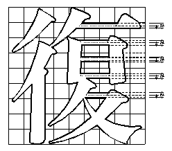
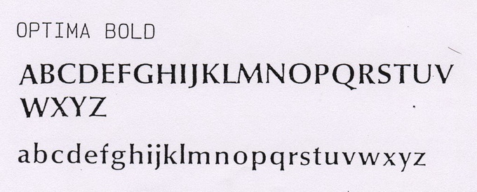
Basic elements of signage include graphics, words, colors and arrow heads. The design should fulfill the basic requirements of being visible, comprehensive, attentive, and readable in order to be functionally visualized design. Graphic: The design of words should match the principles of consistency, continuity, simplicity, readability and be simple, easily-understood, international as much as possible to make viewers understand easily and achieve the function of communication. Words: The design of words should be considered with style, size and word spacing. All texts used in Taipei MRT are both in Chinese and English. Chinese characters used on general sign layout are in Black style (be special Black style or bold Black style according to style size). English alphabets are relatively in Helvetica Medium and Helvetica Regular. Chinese characters in station names use adjusted special Ming style while English alphabet using Optima Bold. Colors: Properly used colors can simplify the complex of information. Each colors of Identity graphics should be specified and cannot be adapted, such as the Taipei MRT Logo. The fixed color system and color numbers should be selected in order to unify the colors while being produced in different processes and materials. The color scheme of Taipei MRT signage design uses Pittsburg Color System which is commonly used for general prints while line colors using Pittsburg Color System which is more stable and suitable to interior finishing. This system uses colors to categorize information types. Service facilities, such as public telephone, information booth, elevators are mainly blue. Warning signs, such as Emergency Stop Bottom illustration, No smoking, No food are mainly red. Exit information are mainly yellow. Arrow Heads: Arrow heads represent directional guide. The best design principle is to use the beams of arrow heads within 90 degree upwards or downwards. The diagrams of arrow heads should be simple and powerful in order to reduce visual and conscious misunderstanding. The diagonal arrow heads in this system are mostly used at the variation of upper and lower floors.


![Taiwan.gov.tw [ open a new window]](/images/egov.png)
